I have to admit that I’m not one of these guys who has always been hooked on politics. In fact, my ten year old son probably – no, make that definitely – has more political awareness than I had until the end of my college years. It just wasn’t really my thing in my earlier years.
What I do remember is that the first Presidential election in which I took a keen interest was the 1992 election. In fact, I was inspired to register to vote by that little man from Texas with the big ears, Ross Perot. But, when he withdrew and then re-entered, I lost interest.
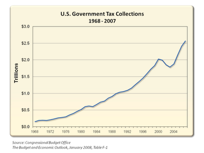
The point of this trip down memory lane is that Ross Perot is back on the scene. This time Perot has some new charts, and the graphs do not paint a pretty picture. One chart I find particularly troubling is the one that shows U.S. Government Tax Collections from 1968 through 2007:

A quick glance confirms that our government does not have a revenue problem, it has a spending problem. So, someone please explain to me why, with all of this growth in revenue, the Democratic Congress and the Democratic Presidential candidate would like to see a sunset of the Bush Tax Cuts?